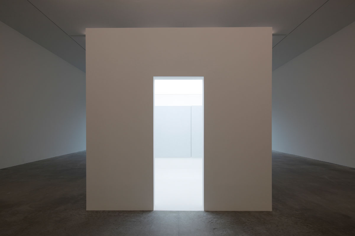
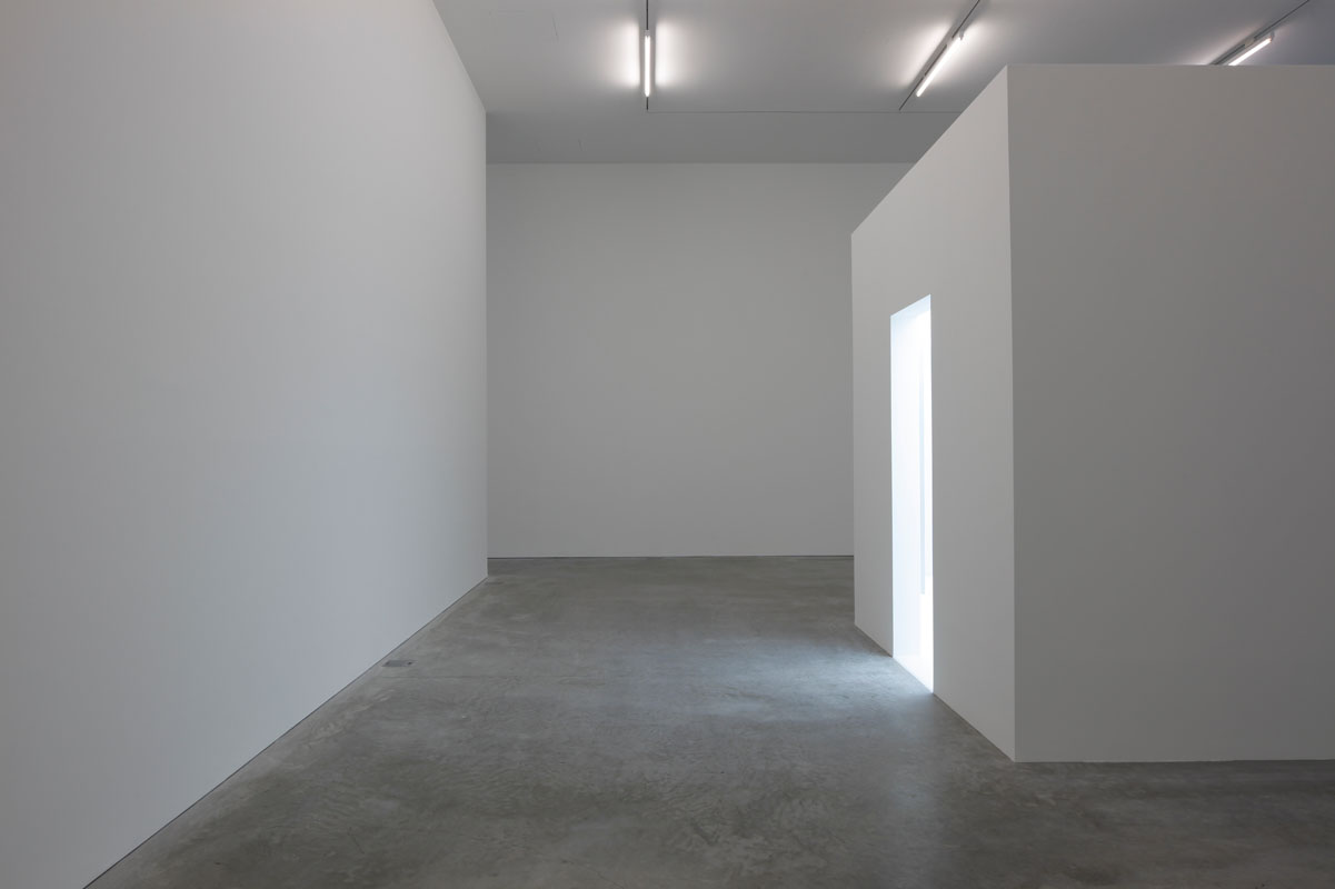
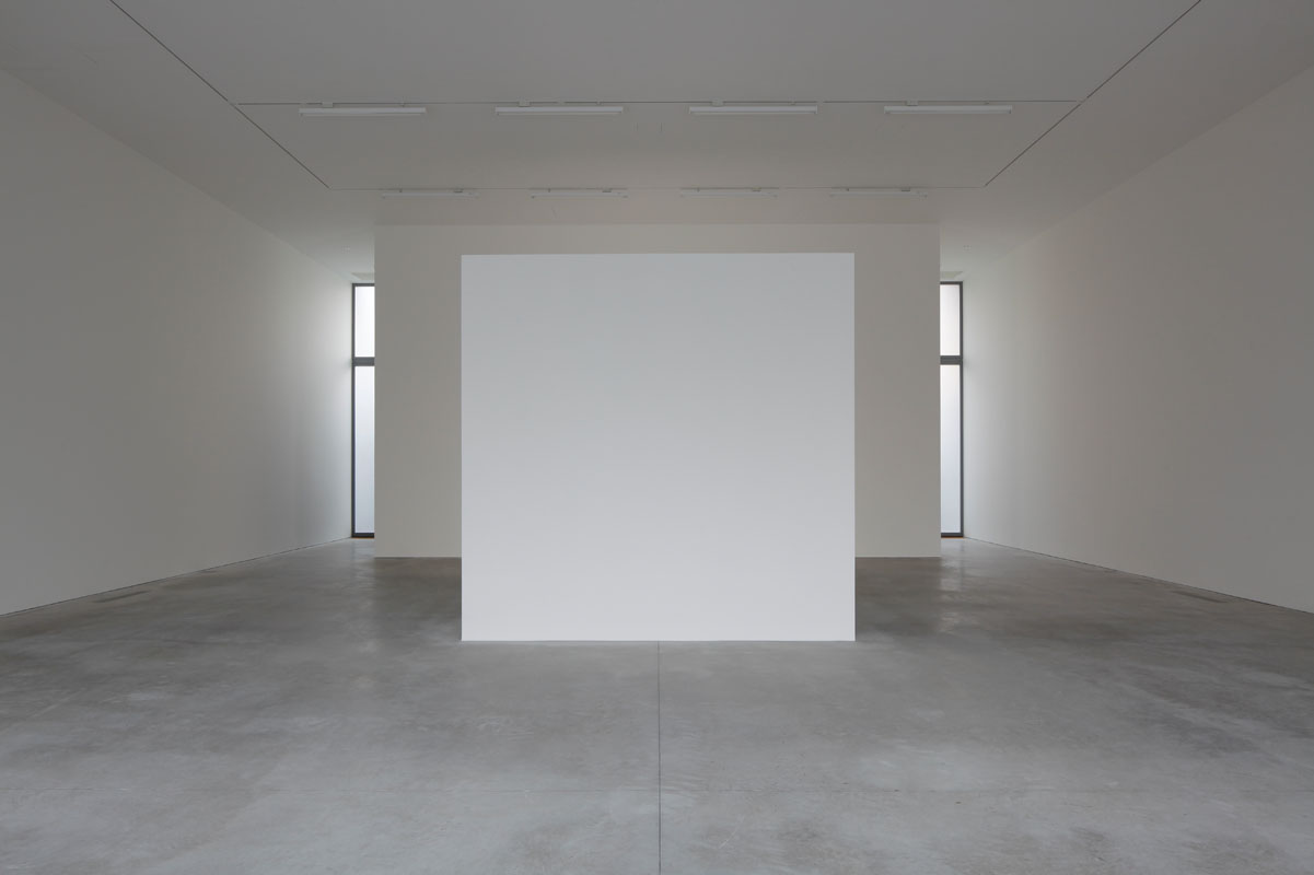
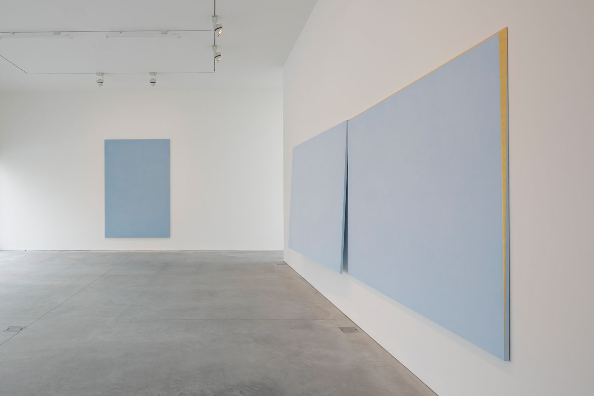
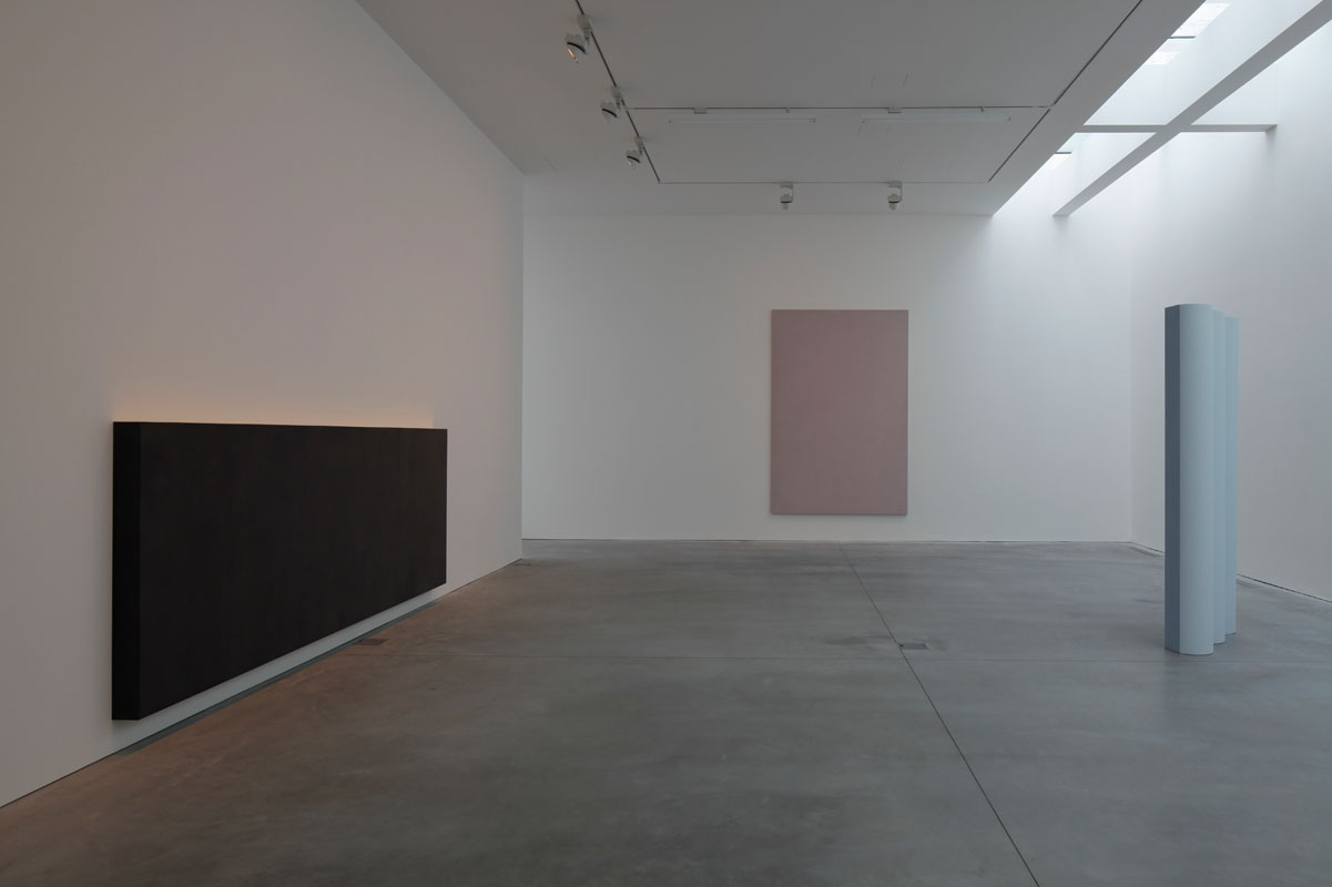
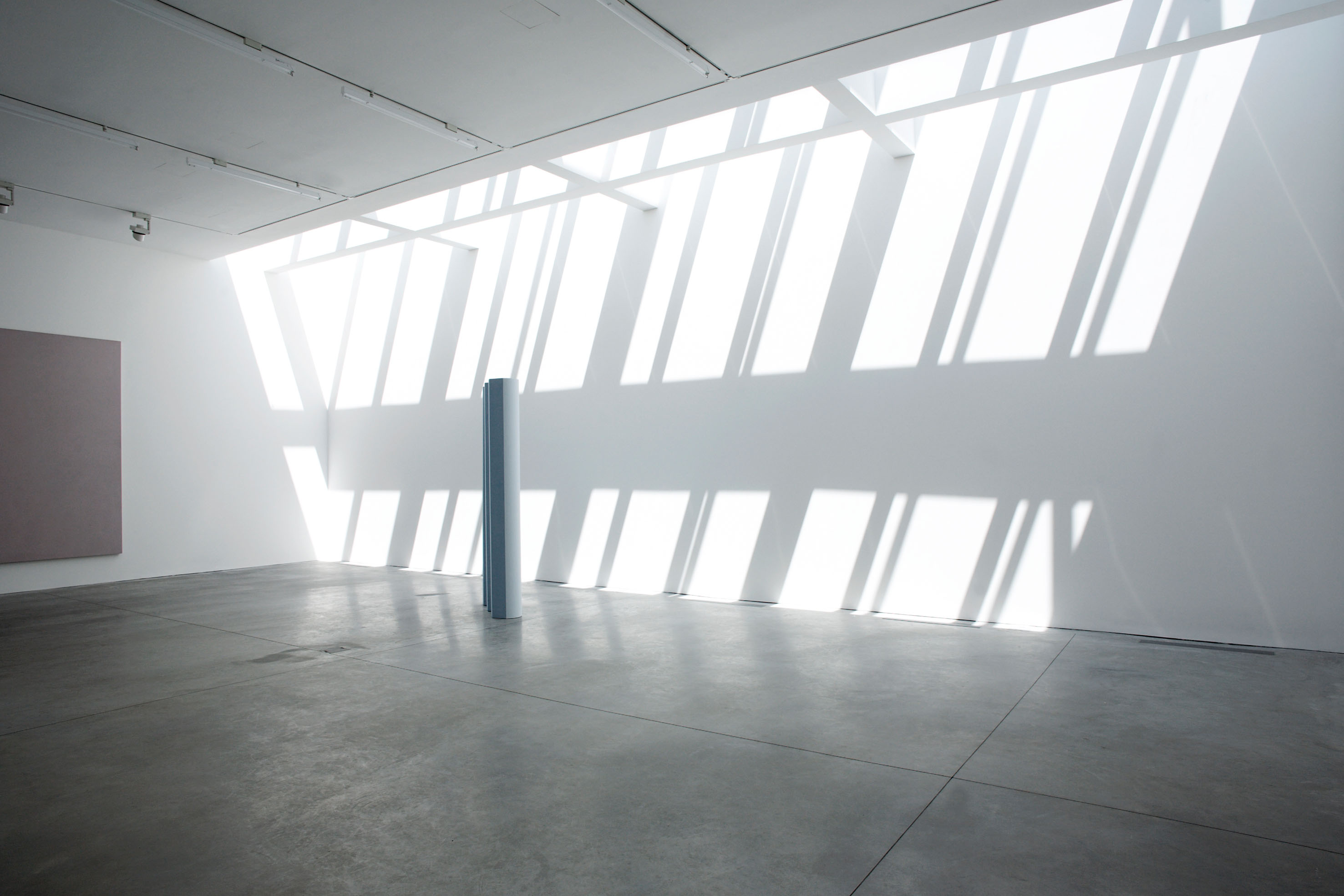
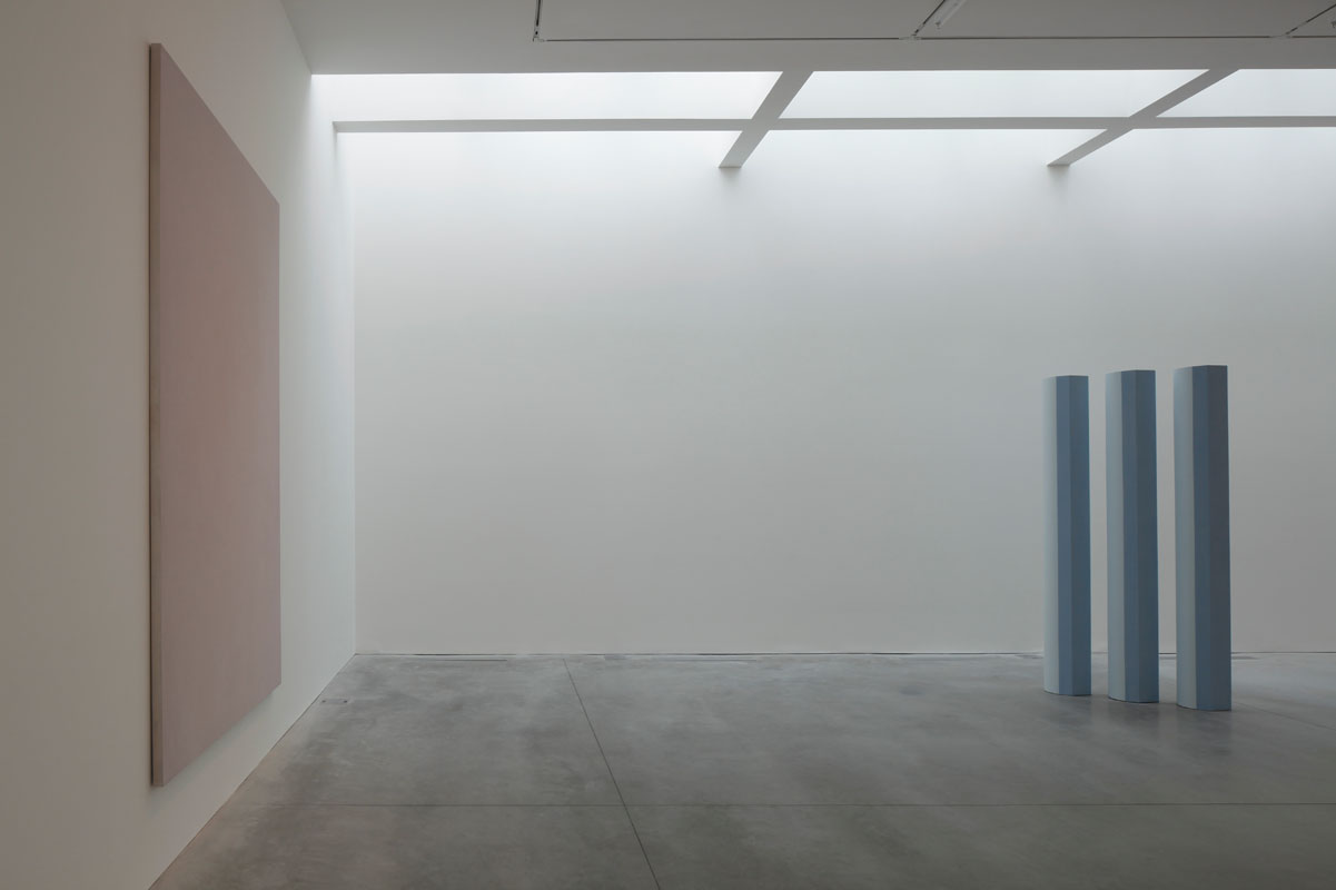
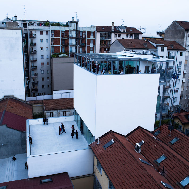
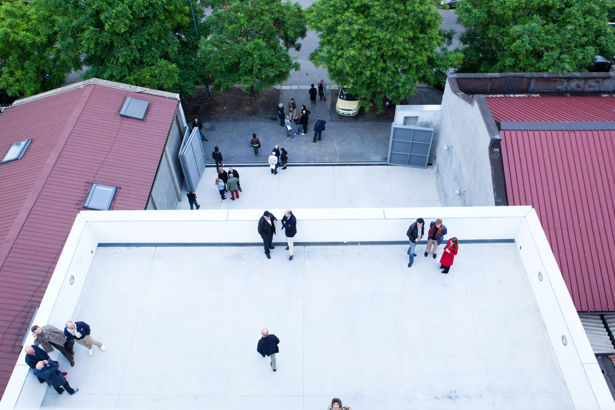
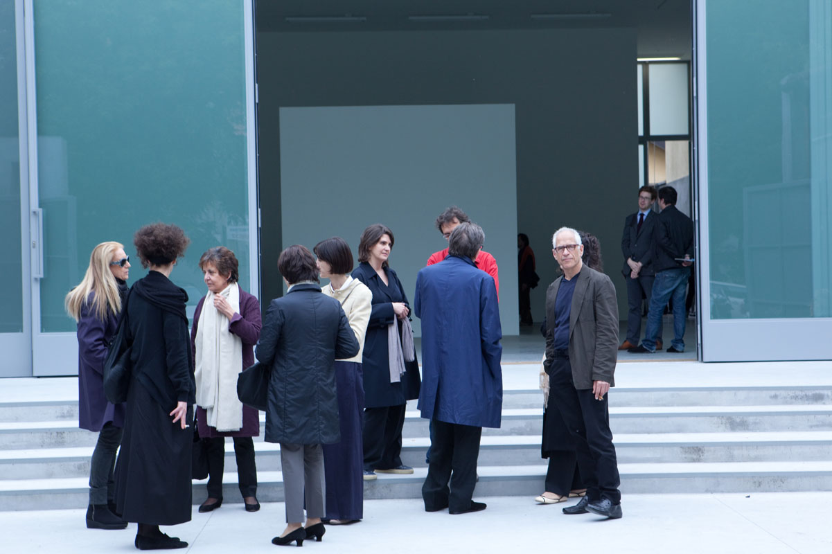
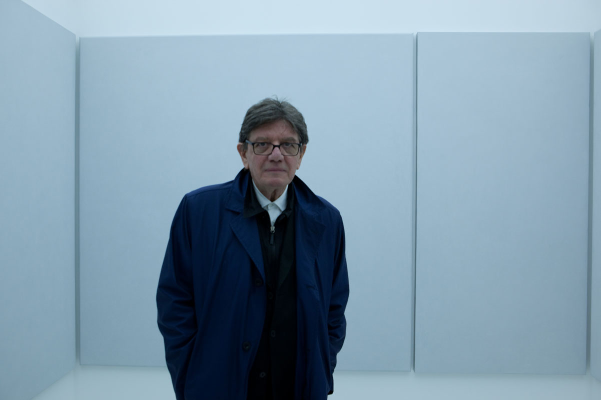
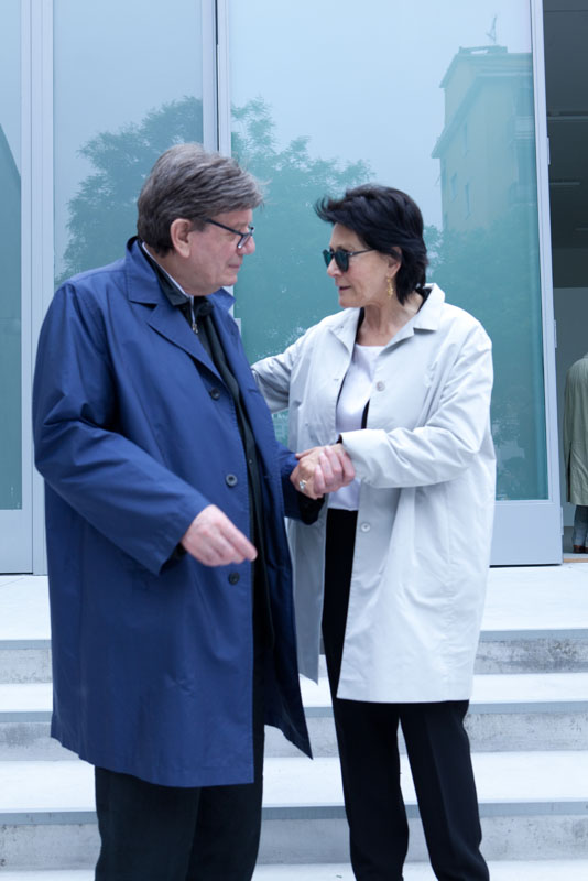
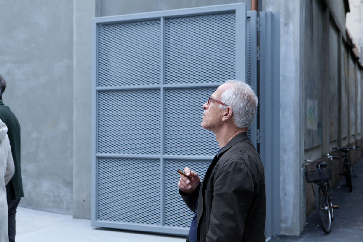
Lia Rumma is pleased to announce the opening of a new gallery in Milan in Via Stilicone 19 with an exhibition of the work of Ettore Spalletti.
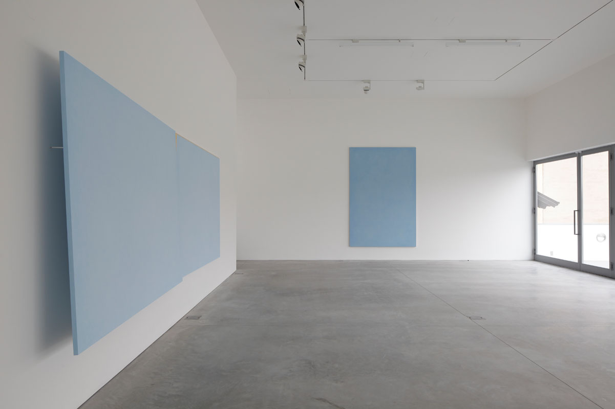
Since the mid-70s, the artist has created a language that is suspended between painting and sculpture, focusing on light and space, an approach which is reminiscent of both modern abstract art and the geometry of Renaissance painting. His chromatic backgrounds cover essential forms which, through the apparent containment within their geometric outlines, become evocative due to the quality of the painting with which they are imbued. The forms are drawn, then transferred to wood, paper or stone, and finally painted. The drawing is therefore simply the support for the work, which only comes into being when the paint materialises. The thickness of the paint is obtained by applying successive layers of mixtures of plaster and pigments, a slow process which takes account of the varying times required for the paint to dry.
The colour is only revealed in the final moment of this long process when abrasion causes the decomposition of the pigments, making the surfaces powdery, like velvety skin, with an infinite range of shades and tonal variations. The drawing gradually drowns in the emerging body of paint and attains the statute that Spalletti establishes for it, that of the outline. There is no painting in the traditional sense of the term, but identification between paint and support; there is no sculpture in the sense of shaping, because the abrasive paper cancels all signs of emotivity. Spalletti’s works are painted in delicate colours over which he always applies white chalk. This prevents the paint from setting in a definitive structure, giving the surfaces a breadth that alludes to life and its figurativeness. “Arranging colours one after the other in order to describe an image, taking the observer on a voyage into the unknown … blue is an atmospheric colour; the blues I use in my works are always different; they can even be distinguished by almost imperceptible quantities of paint. I use blue because it is a colour which never presents itself through the surface of its existence but is a colour in which we are continuously immersed. And the same goes for pink…I use pink because it is the colour of the flesh, so it can always be transformed according to our emotions. In the drowsiness of the sea we can find silver grey. Grey is welcoming, it is a colour that moves towards white but also towards black, which offers the highest quality of all colours.”