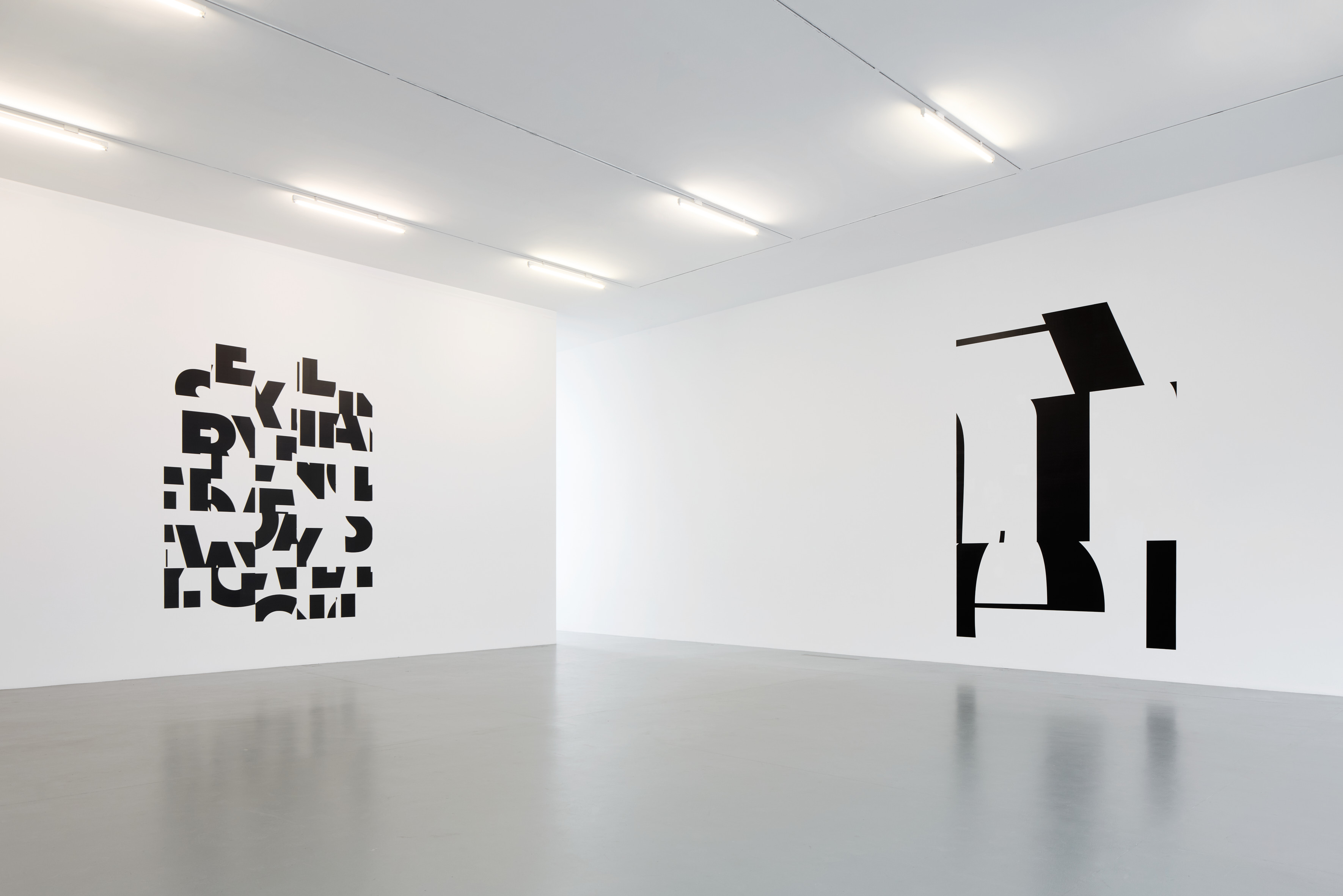
In the mid 1980s two concepts crystallized in Haim Steinbach’s work. One is now so widely recognized that it has become paradigmatic, the structuralist shelf, with its variable scale and strict proportions offering a platform for the selection and arrangement of objects. The other is his work with found texts. Steinbach texts are found objects, they are redeployed with their original typefaces intact. Their scale and position are variable, but the character of the words and their given typefaces gives them a dimension of orality that is crucial to their meaning. We hear them when we see them. This becomes explicit in a work like beep honk toot, 1989. It is as if the typeface is designed to express the tone of the phrase in a way that might be analogous to the facial expression of a speaker.
On the occasion of his exhibition beep honk toot at Galleria Lia Rumma, Steinbach introduces a new direction of his wall works, the “condensed text”, presented on the ground floor. His hello again (condensed) is based on the wall text hello again, 2013, that was exhibited in 2019 at the reopening of the Museum of Modern Art in NY. This work has been digitally processed, or “condensed” through a system of fragmentation and reorganization. Consider a puzzle made of pieces that are parts of a sentence or phrase.
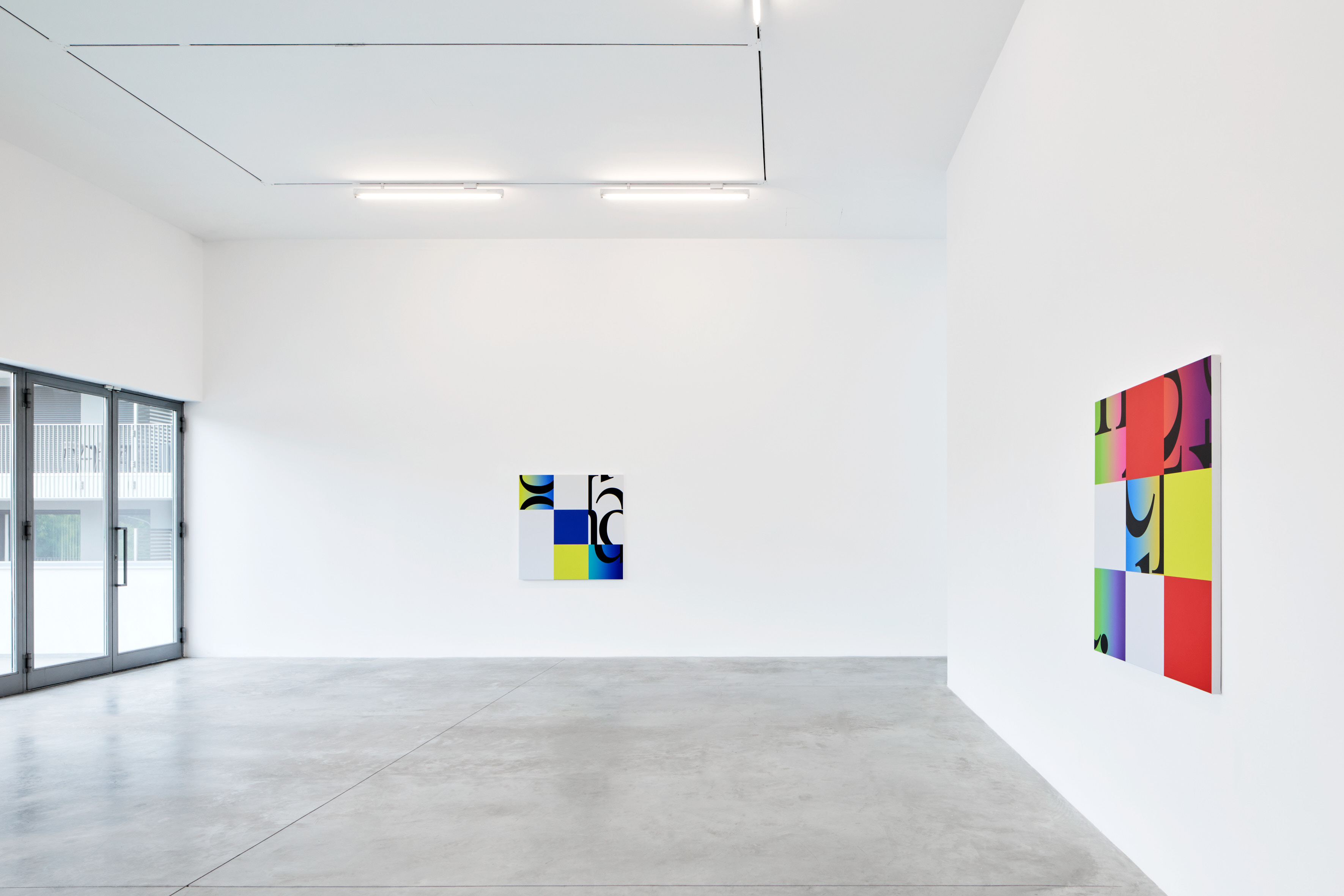
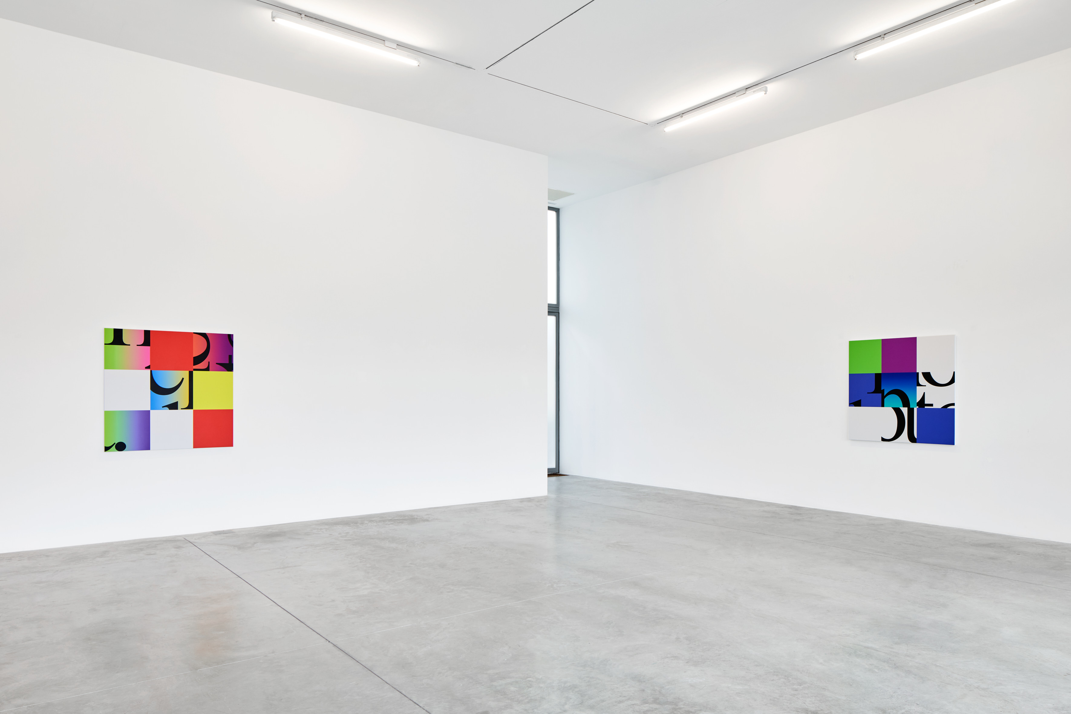
On the first floor, in beep honk toot (condensed/spectrum) Steinbach expands the condensation process to include color. Starting from the wall text beep honk toot displayed in the Forest of Signs: Art in the Crisis of Representation exhibition at the Museum of Contemporary Art in Los Angeles in 1989, the output of the condensation process is restricted to three-by-three tile grid squares. A random number generator produces a series of spectrum gradient and solid color tiles. These tiles are sometimes selected at random to be reoriented or even deleted. The results are then transferred to canvas, borrowing painting’s status as the prototypical platform for thinking color. Painting as convention, painting as shelf even.
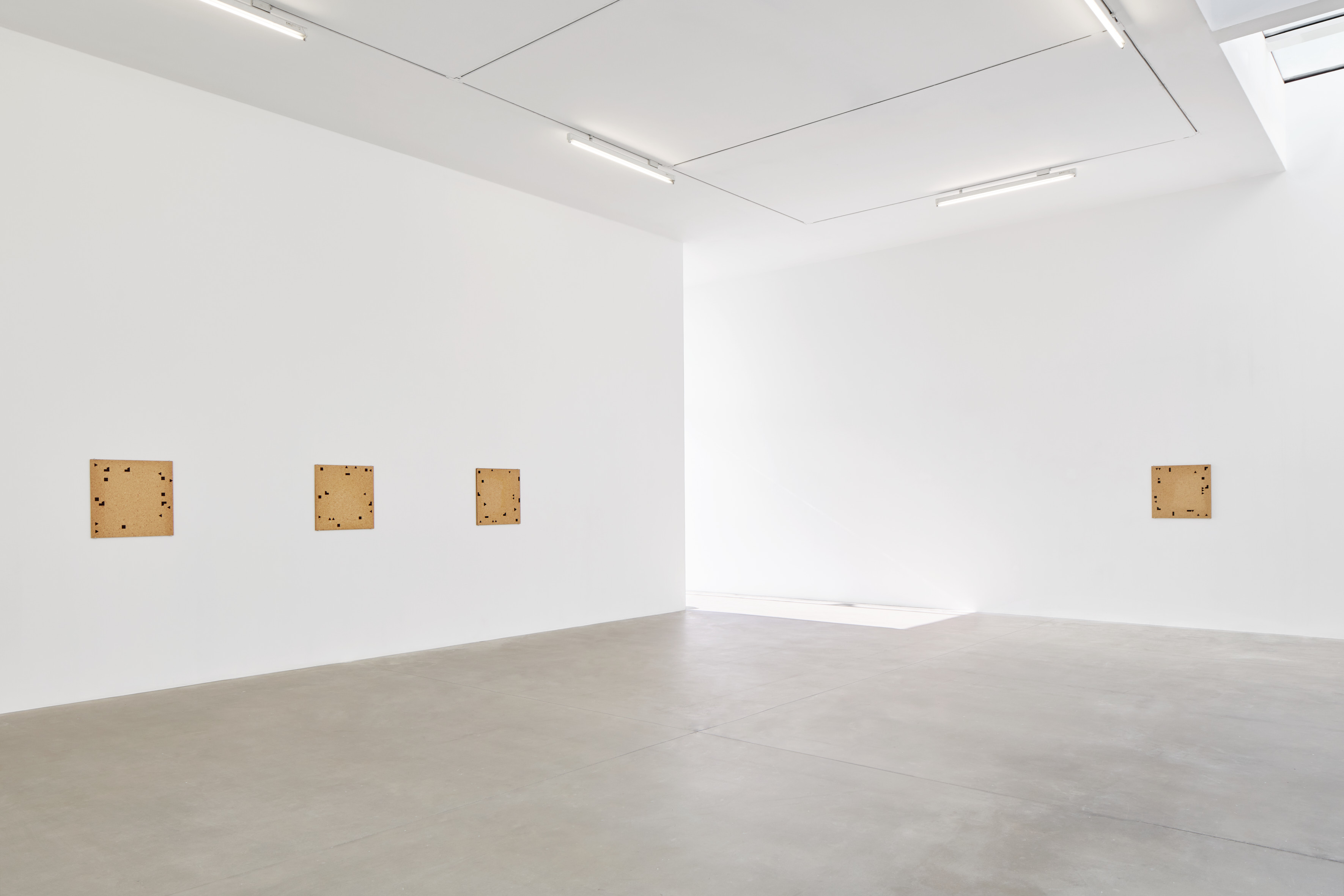
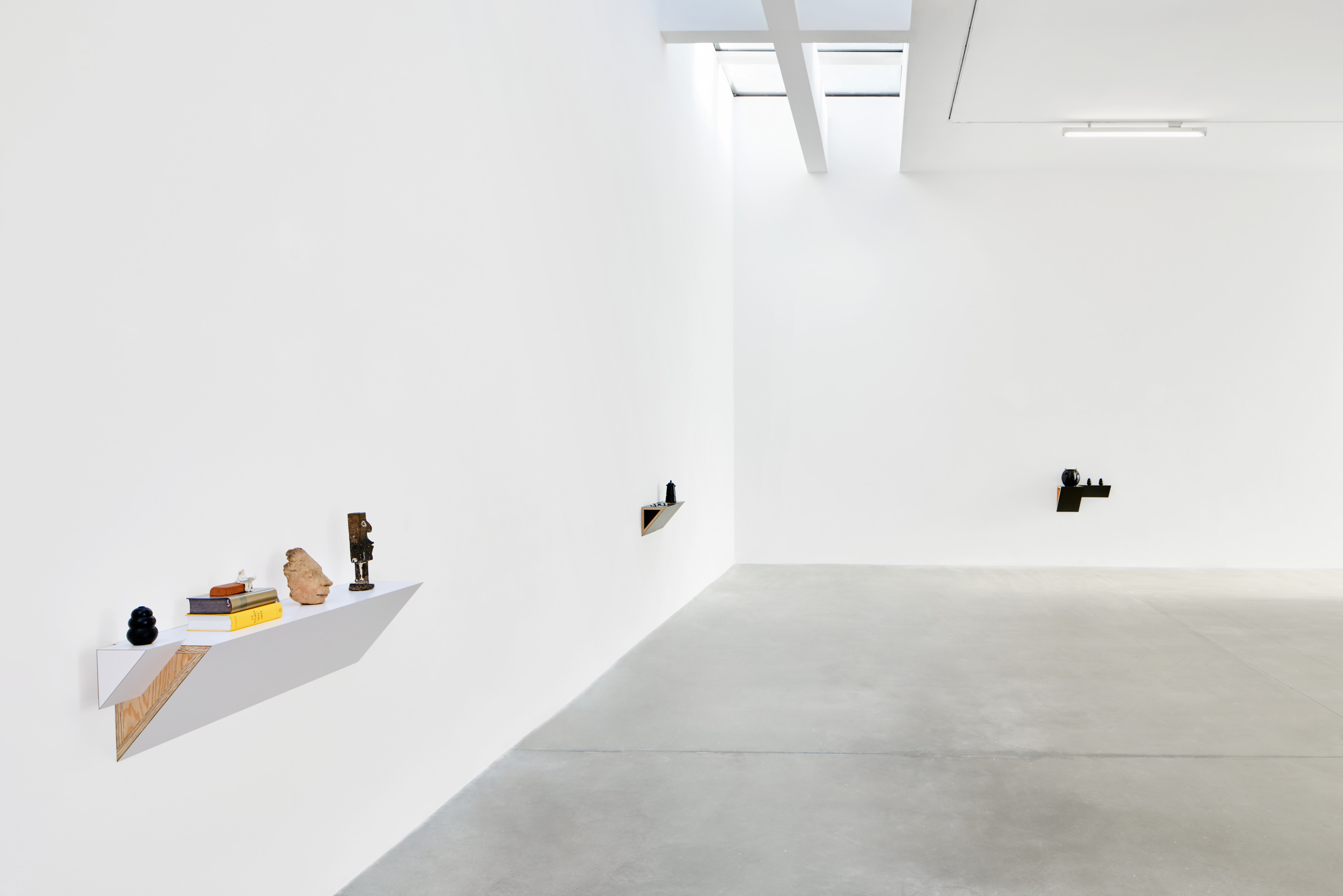
Six Particle Board with Black Shapes works of the mid 1970s and three new shelf arrangements, two of which are commissions with collectors’ objects, are presented on the second floor. The black shapes in the Particle Board works, made with oil stick rubbed through a stencil, are “cut-outs” in a way which prefigure his recent “condensed” works. The “cut-out” is literal, in the cutting out of the shapes from the stencil, but also logical in as much as the shapes are fragments of the underlying grid established by the square format of the particle board panel. Each panel is cut from a standard sheet of particle board, which typically forms the understructure of a gallery wall. The wall repeats itself in the work, and the work draws the architectural support into the game. The tightly proportioned wedge shelves of his paradigmatic shelf and object works follow this logic, extending permutations of the grid into a three-dimensional support.
Punctuation has always been a useful analogy for the ways in which certain features of Steinbach’s object grammar come into focus. Consider his use of the “Kong” rubber dog chew for example, which reappears in this exhibition in his work Untitled (kong, books, sculpture, head, totem). Or the rhyming of forms, cultures, and materiality between the Lavazza coffee maker and the panda chopsticks holder in Untitled (chopsticks, coffee maker). But it’s the black “jack-o’-lantern” basket in his work trick or treat that punctuates the entire exhibition with a provocatively goofy grin. It reminds us that the “cut-out” is embedded in vernacular expressions and display. That a triangle is a nose, that a typeface is a type of face, that a sound has color, that associations can at once be tightly controlled and bewilderingly free.